
Tuesday, November 29, 2011
Kiwis blogging about evolution
As any regular readers here may have noticed, my plate is pretty full at the moment. All you are likely to read here for the next little while are quick photo-centric posts about bugs and maybe a few results of my recreational statistics (I know, it's an illness really) on the New Zealand election.
So, if you are looking for some meatier posts about evolutionary biology and the like, you might want to know that there are a couple of other New Zealanders out there writing on these topics.
Paul McBride is a PhD student from AUT who blogs at Still Monkeys. Paul works on understanding how the ecological setting of a group's evolution can effect the patterns and rates of change observed in that group. So far, his evolutionary blogging has mostly been about junk DNA and the ways in which we know many of the sequences in genomes serve no particular purpose.
I particularly liked finding out that Susumu Ohno had provided a theoretical argument as to why most of our genome would prove to be useless way back in the 1970s -just as the first genetic sequences were being read in labs. You can add Ohno's insight to Haldane's estimate of the human mutation rate (before we knew what a gene was made of!) and Nei's use of the theory of segregation load to show that most observed genetic changes must occur without the help of natural selection and start to see the wisdom of the elders of population genetics! (Paul also blogs about beer, which suits me, and reminds me to add a post about the science of brewing to my todo list).
Jarrod Cusens is a Masters student, also at AUT, and he blogs at of trees birds and other things. I gather Jarrod's research is at the hub of evolution and ecology - specifically looking at how to some habitats end up playing host to diverse, species-rich assemblages of organisms while others are dominated by a few species.
Jarrod's recent posts include a look at a couple of schools in New Zealand who have given up the (very good) biology curriculum in favour of biblical creationism (including one, I'm said to say, in my turangawaewae), a profile of one of the birds that make the New Zealand spring, the shinning cuckoo, with a bit more of the cuckoo's special brand of parasitism and a whole bunch of quotes.
So, be sure to add Paul and Jarrod to your favourite feed reader, and if you know of any other kiwis bogging about evolution and ecology let met know in the comments.
Labels: blog blogging, phoning-it-in, sci-blogs
Monday, November 28, 2011
How did the pollsters go?
A couple of weeks ago I wrote a post comparing the various polling companies that work in New Zealand, trying to see if there were any systematic biases in the results each company produces. In that post, it wasn't possible to compare each company's estimates to an external standard because, without an election its impossible to know exactly what the population is thinking. On Saturday night we got to know just what the electorate was thinking, and there were a couple of surprises.
So, here's the last estimate of each polling company compared with the results from Saturday night for each of the four parties that made the 5% cut:
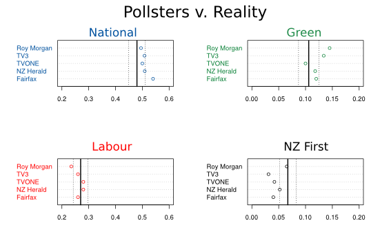
The solid line is the election result for each party. Dashed lines are a 95% margin of error for a poll with 1 000 respondents and the given level of support
As you can see, the polls had National too high and New Zealand First too low more or less across the board. It's hard to say any company did better than the others, Roy Morgan got New Zealand First about right and were the closest to National's final result, but they made up for that by over-estimating the Green Party and under-estimating Labour.
So, why did most of the companies get New Zealand First and National wrong? Of course, it's possible that the polling companies had it right, and that people across the nation changed their minds once they had the orange felt-tip pen in their hands. It could also have something to do with who bothered to turn up on Saturday. In the run up to the election, polling companies generally reported around 15% of the electorate were undecided but about 25% didn't vote. So, some of the people who recorded a preference in a poll didn't bother to have that preference recorded in the election. As far as I know, New Zealand polling companies don't ask any questions to determine how likely a respondent is to vote, and ignoring this information could bias their results.
It's not possible to reconstruct the motivations of those people that didn't show up on Saturday, but we can look at some data at a coarser grain. If people that express a preference for New Zealand First were more likely to vote than the electorate at large (and so, not including a 'likely voter' question in polling would lower their estimate in a poll) then you might expect electorates that really pulled for that party to have higher turnout. It's not perfect, but it's all we've got, and it doesn't really fit the story. National actually had stronger support in electorates with high turnout and there isn't much going on with New Zealand First (I estimate about a 0.8% increase in support votes per 1 000 voters, but that's not near to significantly different from no increase):
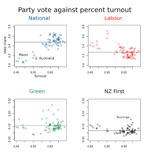
Percentage turnout is calculated relative to total enrollment for electorate (special votes not yet included)
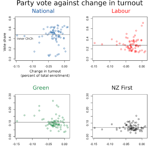
By the way, that graph, with such poor turnout in the electorates that with the largest proportion of Labour voters, might be depressing viewing for Labour supporters. Indeed, I'm sure they'll want to work on "getting out the vote" in the Māori electorates and South Auckland, but that pattern doesn't explain the erosion of Labour's support in this election. Turnout was low in these electorates in 2008. Here's the support for each party plotted against change in turnout for each electorate (not including special votes):
Labels: election, pretty-data, sci-blogs
Sunday, November 27, 2011
Sunday Spinelessness - How long 'till they rise up and kill us all?
The title contains everything i have to say on this video:
Labels: cephalopods, octopus, sci-blogs, sunday spinelessness
Saturday, November 26, 2011
Will early returns accurately predict tonight's outcome?
It's election day.
I'm sure that later this evening we'll be treated to one of the staples of election night coverage, results from early returns delivered with the qualifier that they are unlikely to represent a reliable estimate of the final result.
Part of that reason for that qualifier is the obvious point that any small sample only provides an uncertain estimate what's going on in the population large. That sampling error can be compounded if there is some bias that makes the early-returning booths pull further left or right than the population at large. In New Zealand at least, you'll often here people say the small polling booths that quickly count and report their results are predominantly from rural areas and, so, favor right wing parties compared with larger, urban booths. (The meme that passes among some right-wing folks, that Labour only won the 2005 election because of South Auckland voters is an example of this narrative).
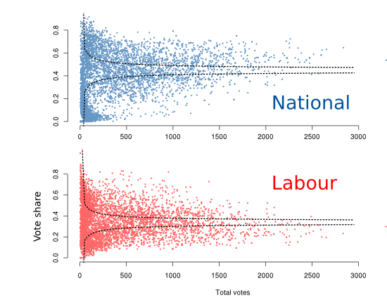
So, I thought I'd see if there was any evidence for that these stories are right. It's easy to get the data from each of the 6 000 or so polling booths used in the 2008 election and munge it together to see if there is a relationship between how red or blue a booth was and how many people voted there (which is a pretty good proxy for how quickly the results will be reported):
I'm sure that later this evening we'll be treated to one of the staples of election night coverage, results from early returns delivered with the qualifier that they are unlikely to represent a reliable estimate of the final result.
Part of that reason for that qualifier is the obvious point that any small sample only provides an uncertain estimate what's going on in the population large. That sampling error can be compounded if there is some bias that makes the early-returning booths pull further left or right than the population at large. In New Zealand at least, you'll often here people say the small polling booths that quickly count and report their results are predominantly from rural areas and, so, favor right wing parties compared with larger, urban booths. (The meme that passes among some right-wing folks, that Labour only won the 2005 election because of South Auckland voters is an example of this narrative).
So, I thought I'd see if there was any evidence for that these stories are right. It's easy to get the data from each of the 6 000 or so polling booths used in the 2008 election and munge it together to see if there is a relationship between how red or blue a booth was and how many people voted there (which is a pretty good proxy for how quickly the results will be reported):
If polling booths were unbiased samples of the electorate (they really aren't...), we'd expect all 99% of the dots in these graphs to fall between those dashed lines.
As you can see, at least in 2008, the common wisdom appears to be wrong: the larger polling booths went more toward National and less toward Labour than the rest of the country.
Tonight's early results will certainly only be an indicator of where things will end up, but things won't necessary get better for left-leaning parties as the night goes on.
UPDATE Thanks for a comment from Luis Apiolaza, who suggests a better way of getting the question. These plots show the percent favouring each major party after each polling booth's data is added in order of how many votes were recorded. As you can see, it takes a long time for Natinoal's vote to approach its final number. I wonder if this is in part be an artifact of many small booths in Maori electorates? Of course, polling booths won't necessarily report in order of how many votes were cast in them.
UPDATE Thanks for a comment from Luis Apiolaza, who suggests a better way of getting the question. These plots show the percent favouring each major party after each polling booth's data is added in order of how many votes were recorded. As you can see, it takes a long time for Natinoal's vote to approach its final number. I wonder if this is in part be an artifact of many small booths in Maori electorates? Of course, polling booths won't necessarily report in order of how many votes were cast in them.
Sunday, November 20, 2011
Sunday Spinelessness - Hover fly
One of these days I'll use these posts to say something substantive and intersting about the nature of life on earth. Today is not that day. Instead, an old photo of the most common pollinators in New Zealand gardens: Melangyna novaezelandiae, the New Zealand Hover Fly:

Labels: hover-fly, sci-blogs, sunday spinelessness, Syrphidae
Sunday, November 13, 2011
Sunday Spinelessness - The 95%
No the least bit original (1,2), but fun, and entirely featuring critters that have appeared here in the last year or so:

Fans of the spineless may want to join the Octopi wall street movement of Facebook.
Labels: photos, sci-blogs, sunday spinelessness
Wednesday, November 9, 2011
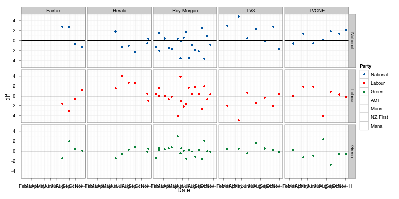
Polling bias among local pollsters?
Lew from Kiwipolitco stumbled across an interesting analysis of Australian pollsters, looking at whether the methods employed by particular polling companies might lead to biases in the numbers they produce .
As that post notes, it's impossible to tell whether any particular pollster is showing a bias with respect to the real levels of support for each party, because we only find out what the whole population is thinking when we have an election. We can, however, see if a particular polling company is pulling in a different direction than others. Since I've had about all the thesis-editing I can stand for one day, I decided to see if the data I put together for those charts from this morning could tell us anything about polling bias among New Zealand pollsters.
Obviously, the first step is decide on how to find the "average" number against which all polls should be compared. I went with a local regression which just fits a smoothed line through all the points. From there you can measure how far a single estimate is from the smoothed value at the same date*:
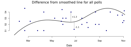 Even if all the companies are perfectly sampling the population, we'd expect estimates from single polls to show a good deal of scatter, just because polls are estimates of the population value and come with uncertainty. Indeed, there are dots all over the place in that graph. By collating all those differences between a point and the smoothed lines for the same date we can see if any of the companies are consistently finding higher or lower estimates of a party's support:
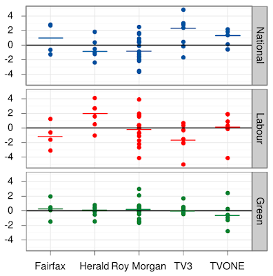
And the answer is... sort of. It seems TV3 tends to get National a little higher and Labour a little lower than the rest of the pollsters, and perhaps the Herald goes the other way. I think trying to gain anything more meaningful than that from these results is probably the statistical equivalent of reading tea leaves, but feel free to stare at the graph and confirm your own political biases!
*You should note, this approach introduces biases of its own and you should take these results with several grains of salt. In particular Roy Morgan polls a lot more often than the other companies, so that company's polling will contribute more towards the smoothed line than others, so it's no surprise they show only small biases.
If you are interested in trends in polling bias, I have these differences plotted over time here. As always, I have the raw data here so let me know if you want a csv file to play with.
Obviously, the first step is decide on how to find the "average" number against which all polls should be compared. I went with a local regression which just fits a smoothed line through all the points. From there you can measure how far a single estimate is from the smoothed value at the same date*:
And the answer is... sort of. It seems TV3 tends to get National a little higher and Labour a little lower than the rest of the pollsters, and perhaps the Herald goes the other way. I think trying to gain anything more meaningful than that from these results is probably the statistical equivalent of reading tea leaves, but feel free to stare at the graph and confirm your own political biases!
*You should note, this approach introduces biases of its own and you should take these results with several grains of salt. In particular Roy Morgan polls a lot more often than the other companies, so that company's polling will contribute more towards the smoothed line than others, so it's no surprise they show only small biases.
If you are interested in trends in polling bias, I have these differences plotted over time here. As always, I have the raw data here so let me know if you want a csv file to play with.
Labels: election, pretty-data, sci-blogs
Election graphics
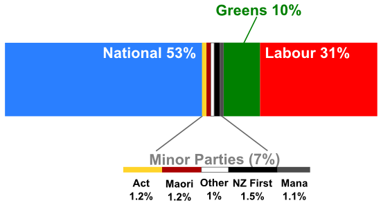
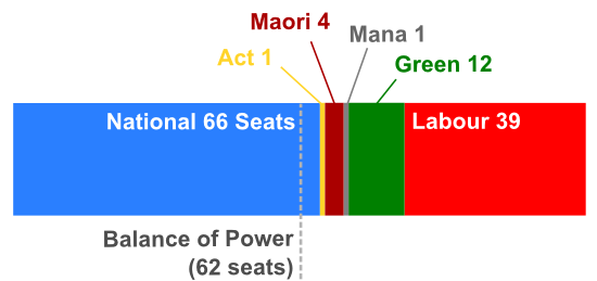
As you may have noticed, there is an election around the corner. I'm not about to subject anyone to my political opinions, but I do have an area interest in which I could probably match the most tribal Labour or National supporter for fervent opinion. Bad graphs. Being able to clearly and succinctly display data is a really important scientific skill, and it's one that some of our newspapers have so far failed to develop. Take this chart, which appeared in the Christchurch Press and is apparently showing the break-down of a recent poll (thanks to John Kerr for pointing this out on Stats Chat)


*It should be pointed out, these thresholds are really indicative rather than absolute. The real cuts with vary depending on how many votes go to parties that don't make the 5% threshold or win an electorate seat and the size of any overhang
The polling data used here is taken from Wikipedia. Contact me if you want a csv file with the dates in an R-friendly format. The stacked bar charts were done manually in Inkscape and all the other plots were done with ggplot then tweaked in Inkscape.
I have no words. I honestly have no idea why there is a third dimension in this chart, or, really what I'm meant to take from any of it. This was so bad I had to have a go at fixing it.
The point of a political poll is to tell which party, along with its idealogical allies, is likely to win a majority of the seats in parliament. Since we are talking about proportions, and there is a real "something" that those proportions add up to, this a rare case in which a pie chart (or its bastard cousin the torus) might make an effective visualisation. Even so, people are generally better and assessing differences between lengths of objects than their area, so I went with a stacked bar chart.
Of course, even MMP isn't a perfectly proportional electoral system, and, especially with the overhang likely caused by the Māori Party winning more electorate seats that their party votes alone would entitle them to, the break-down of seats in parliament won't exactly match the break-down of the party vote. Here's what would happen if these results were mirrored on election day, and Act, Mana and the Māori Party held their electorate seats while the fine people of Ohariu-Belmont remove Peter Dunne, the Member for the anti-1080 lobby.
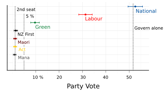
In this case, if Act were to lose Epsom the next list seat would go to the Green Party. Of course, you shouldn't use a single poll to say anything very meaningful about what a specific result is likely to be. Polls are estimates of what's going on in the population at large, and estimates always come with uncertainty. We can go some way to quantifying that uncertainty but giving each estimate a "margin of error". Using some slightly twisty logic you can say, "we don't know what the support for the National Party really is, but if it was 52.6 %, as our poll suggests, and we did lots of surveys, each of 1000 people, then 95% of the time we'd get a result between 49.5% and 55.7%". It's hard to include that uncertainty in a stacked bar chart, so here's each estimate from that poll, along with its margin of error (the "2nd seat" line is at 1.2%, the point at which a party with an electorate seat would probably get another on the list, the "govern alone" line is 51.6%, the proportion of party votes required to get 62 seats, a majority in a 123 seat parliament*)
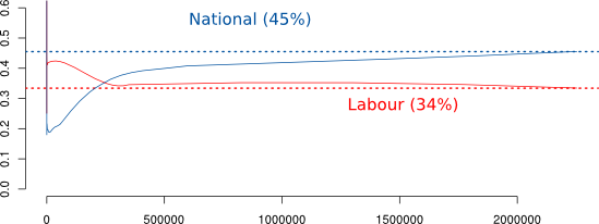
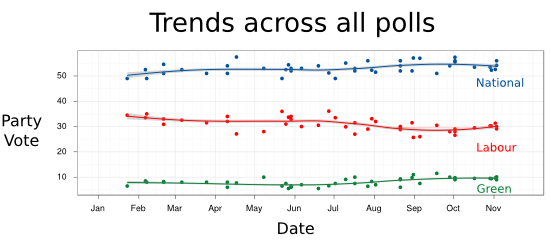
If the fairfax poll was the only thing we had to go on, it might give left-leaning folks (like me) some hope that the true value of the National Party support was less than the "govern alone" threshold. Unfortunately, we have a whole series of polls conducted over the course of the year that suggest National's support is pretty close to the point estimate, and there appears to be little trend across those polls (except perhaps the Green party picking up Labour supporters):
That chart munges all the political polls taken this year together, and fits a smooth line between them. But some polls are probably better than others, it's hard to take a truly representative sample of the country, and it's likely that some of the companies running the polls do a better job. So here's the trend across each polling company:
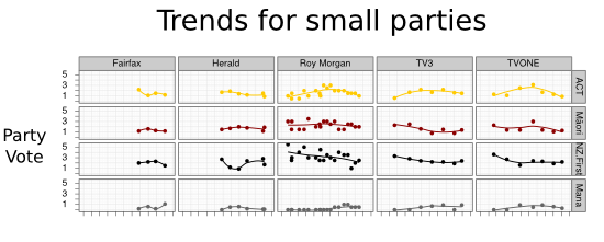
And you can do the same thing looking at each of the smaller parties.
I'm sure there are lots of ways you could improve these charts (let me know if you think of some), but surely they are all more useful than that awful one from The Press?
*It should be pointed out, these thresholds are really indicative rather than absolute. The real cuts with vary depending on how many votes go to parties that don't make the 5% threshold or win an electorate seat and the size of any overhang
The polling data used here is taken from Wikipedia. Contact me if you want a csv file with the dates in an R-friendly format. The stacked bar charts were done manually in Inkscape and all the other plots were done with ggplot then tweaked in Inkscape.
Labels: pretty-data, sci-blogs
Sunday, November 6, 2011
Sunday Spinelessness - A darkling beetle
Life continues to be busy down here in Dunedin, so this will have to be another Sunday marked by a quick photo-heavy look into the world of the spineless.
I don't pretend to be a great photographer, but I do get a lot of pleasure from recording the small creatures I come across. One of the real joys of bug photography is the way even a rank amateur like me can find something that wasn't obvious at first glance. Take this darkling beetle (tenebrionid) I found the other day. An interesting enough beetle...
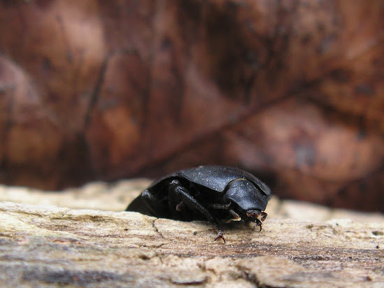
...but it wasn't until I'd seen the photos that I notice those neat compound eyes, it's as id I'd found a trilobite
in my garden!


Labels: beetle, photos, sci-blogs, sunday spinelessness

All content not otherwise marked is licensed under a Creative Commons Attribution-ShareAlike 3.0 Unported License.

