Monday, April 19, 2010
Relative Risk Averse
Over at sciblogs Peter Griffin has a post about apparently contradictory evidence on the role of multi-vitamins in breast cancer. We probably shouldn't be too surprised that different studies can look at the same question and get a different answer - biases, methodological errors and sheer dumb luck can affect the results of individual studies. For that reason we should try to draw conclusions on a body of literature, not a single paper. The Guardian's article probably does the best job of summing up how the new paper should update our picture of breast cancer risk:
Let's compare that with The HeraldIf you are a woman and regularly take a multivitamin, you may be concerned by these findings. However, we don't yet know whether multivitamins actually increase the risk of breast cancer. We need more studies.
However, we also don't know whether these supplements have benefits for most healthy people. If you eat a well-balanced diet, you might reconsider whether you need to take a multivitamin.
How can the Guardian be so calm when the Herald is clearly terrified? Part of the reason is the Herald's article, like most stories on heath studies, is parroting a potentially misleading statistic called the relative risk. That's the difference in the risk of getting some disease for a group exposed to some factor (in this case multi-vitamins) and those that aren't exposed. The relative risk can be a useful summary of a study's results, because it tells us how big an effect the risk factor being study has on the disease in question, but it doesn't tell the whole story.Women who regularly take multi-vitamin pills face a much higher risk of breast cancer, a study has found.
The Swedish study, which looked at more than 35,000 women aged between 49 and 83 during a 10-year period, found that women who take daily multi-vitamin pills are nearly 20 per cent more likely to develop breast cancer.
Take the recent story about pancreatic cancer and soft drinks. That study found people who regularly drink soft drinks face an 87% greater risk of developing pancreatic cancer, which sounds like really bad news until you realise your lifetime risk of pancreatic cancer is about 0.2%. If the papers had to run a story saying the absolute risk of pancreatic cancer moved from 0.2% to 0.37% when you drank a couple of cokes a week the headlines would have been a little more subdued than they were.
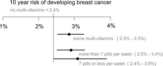
The other problem is papers usually focus exclusively on the point estimate of the relative risk ("nearly 20% more likely", "87% higher risk"...) and ignore the uncertainties associated with those estimates. Carl Sagan got a little religious about error bars in The Demon Haunted World where he described them as "pervasive, visible self-assessments of the reliability of our knowledge" and wished all political statements included them. In fact, error bars don't represent the full extend of our uncertainty, only how far our estimate of the risk might be from the mark if the study has avoided selection biases and applied its methods correctly. Still, wouldn't it be nice if newspaper stories on new medical studies had a little graphic like this to but the results in context:
Labels: health, pretty data, sci-blogs, statistics
1 Comments:
shouldn’t there also be error bars on the “no multi vitamins” risk? That would really drive home the point.
My reply:
I knew someone would ask about that (or that I used ‘less’ instead of ‘fewer’ in the annotations).
You’ve actually opened a bit of a can of worms here, the confidence intervals that you get from models like the one in the paper are the standard error the the difference between group means so perhaps it should say no vitamins ~ 2.4 and the the axes centered 0 for the difference between groups. I tried to translate that into “real” terms, but perhaps that obscures the message?
You could plot the mean of each group with error bars, but Most researchers don’t understand error bars so I’m not sure that’s a help. I was really thinking of forest plots, which would also allow you to show different studies on the same axes.


All content not otherwise marked is licensed under a Creative Commons Attribution-ShareAlike 3.0 Unported License.